- Cathedral Sketch
- Canta Per Me, Winter
- Aria Landscape Sketch
- Aria Background
My name is Kathy and I created all of the illustrations and costumes for Hideo. I am always interested in hearing and learning about people’s creative processes, so I figured I should talk a little bit about my own. I’ll discuss first the inspirations and decisions that led us to the world of Hideo.
Creating the artwork for Hideo was a challenge for me in many ways. Mainly, my life has not been overly saturated with anime or video games, though I am familiar with and interested in both. Blair assured me that my mild ignorance of the genre would only bring to it a unique perspective.
There is a fun challenge in setting the visual mood for a whole new story. To be fair, I believe Schyler had the harder task of coming up with the story with little to no direction – I at least had the benefit of a few of his rough drafts to build my ideas upon. As the story and world were being fleshed out, I realized how many considerations had to go into the process: What era are we in? What architecture/style is present? What kind of clothes do the people wear? What weapons do they use? What’s the general mood, visually? And further, how do you keep these all as generic as possible – as timeless as possible? How do we pay a homage to the stories of anime and video games without calling upon one or the other too obviously?
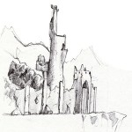
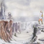
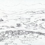
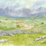
Blair collected a number of samples for me, pulling from such examples as Final Fantasy and Fullmetal Alchemist for direction. We decided on a world of the not-so-distant future: rough and beaten, with mostly relics to rely on for technology. It was dirty and broken, and could be any place devastated by years of wars and strife. Muddy colors, semi-modern clothes, and indistinct architecture (mostly in ruins) set the tone for the story. My true pleasure in this project came from creating the background landscape illustrations. The world was fun to create, but even more fun to paint! I sketched the landscapes with pencil, then painted with gouache on watercolor paper, scanning in the images and manipulating them digitally to enhance their vibrance and contrast. As I described, the world was somewhat of a post-apocalyptic, worn out, tired space, but some scenes embodied a more uplifting mood. For these moments, I chose more lush, open imagery. Most of the scenes later in the story – where our heroes faced their foes – featured background images with high contrast, almost completely grayscale, giving the feeling of a stark, oppressive environment. I had a lot of fun manipulating the mood by varying these elements.
And with that, the world of Hideo took form. Stay tuned: the next big step I’ll discuss is how we developed the characters!


The image links don’t work.
Thanks Jonathan, it should be fixed now.